Andrew Higgins has sent me several interesting social network analyses based on my son's and my recent citation analyses from the Stanford Encyclopedia of Philosophy.
First, some pretty pictures, then some explanations. I can't embed the hi-res pictures properly in this narrow-column post, so please right-click to "open link in new tab" for the full view, then zoom in and out, scrolling around. If you want pictures hi-res enough to read even the smallest font entries, I've posted them here, here, and here.
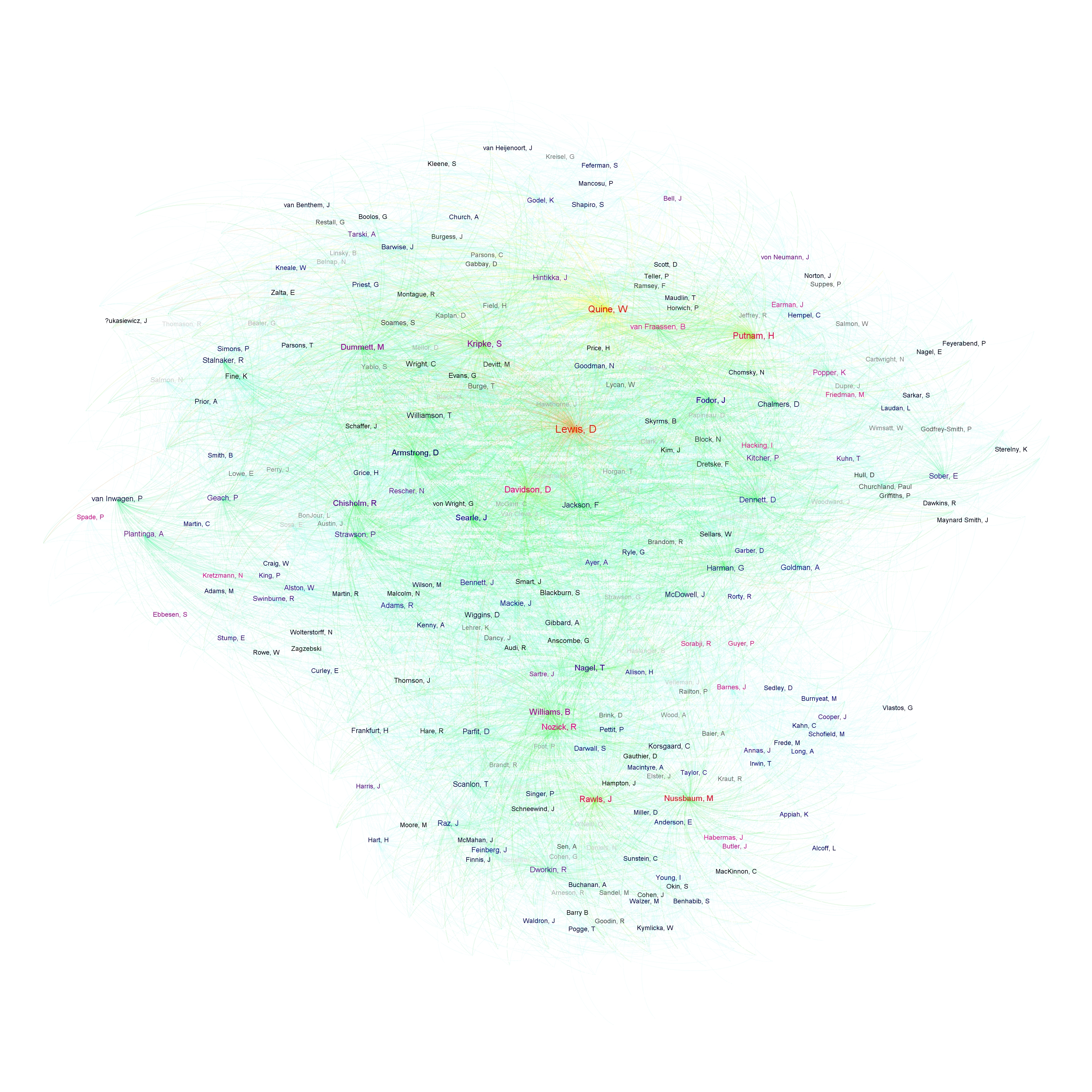
First, SEP cited authors:


The closer two authors or articles are, the closer together they are in the social/intellectual network, as measured by overlap in citation. For authors, they are closer if they tend to be cited together in the same entries. For articles, they are closer if they tend to cite the same authors.
For the authors, the larger the font, the more they have been cited. The transition of label colors from black to blue to purple to red indicates increasing "centrality" to the network, where "centrality" is a combination of three factors: (a.) how much the author (or, for articles, the authors it cites) is cited in other SEP entries, (b.) how much the author is cited by more "central" articles specifically, and (c.) the extent to which an author or article constitutes a "short path" between more remote nodes (e.g., Popper and Putnam on the path between the philosophy-of-mind cluster and the philosophy-of-science cluster, being cited in both areas). Citation rate and centrality tend to correlate but sometimes diverge, as in the case of Sartre and Nagel (middle center of the authors graph), with Nagel more cited but Sartre more central.
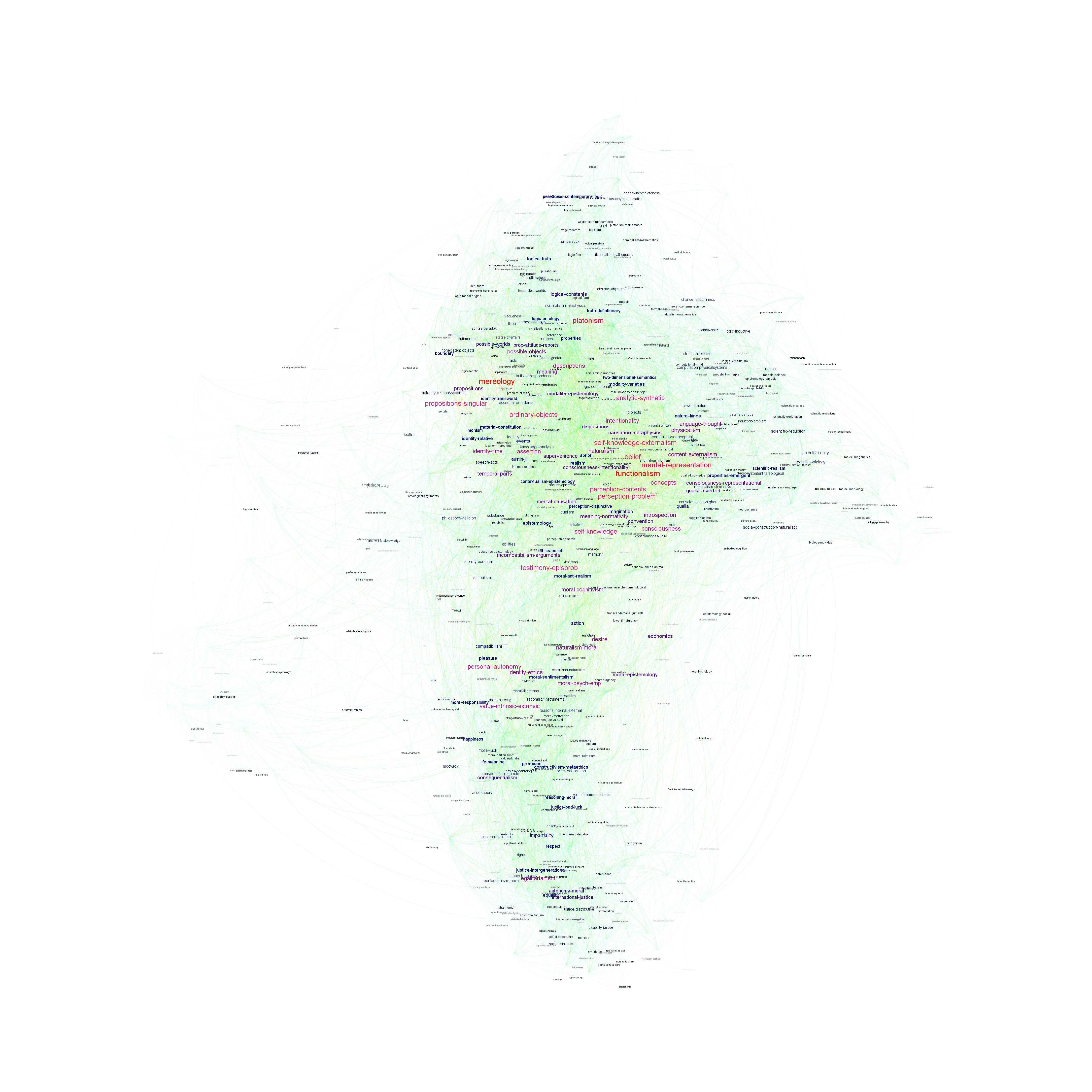
In the articles graph, font size and color indicate how many references the article includes; in the other graphs, the articles' font has been minimized.
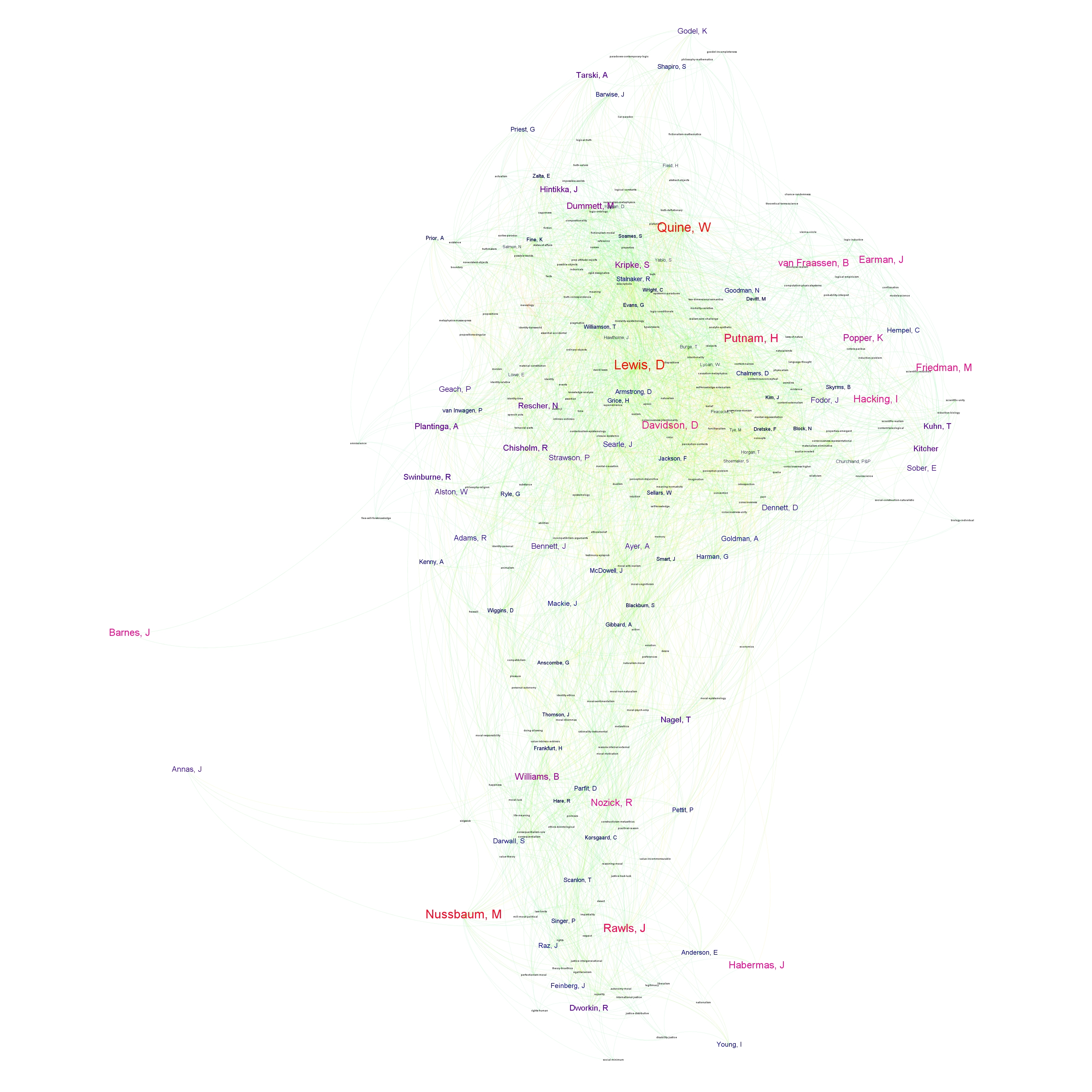
Finally, here's a picture of the network broken down into six groups of authors and articles, determined by network proximity, using a modularity measure that detects the most natural groupings of nodes (labeled manually based on Higgins's judgment about the general theme of each group). Line thickness and color represents the strength of the between-group connections. Numbers and node size indicate the number of authors and articles represented by each group. :

If you have questions about how the results were generated, please feel free to contact Andrew directly. I'm hoping, too, that he'll check the comments section of this post for the next week or two.
Update, September 24:
Check out this one too, from InPho DataBlog in 2012 (HT Colin Allen).

4 comments:
Having trouble viewing the pictures. When I click through to them they appear too small for me to read, but when I click on them, instead of enlarging it moves to the next picture in the gallery.
Sorry about that, Amod! Try downloading using the links near the top of the article, then viewing them as picture files. Or try right-clicking and opening in a new browser window.
Good idea - that's better.
Post a Comment